Restaurant website: 2 tips for attracting new customers online

A restaurant website is not only a reference point for customers, but also a way to reach new ones and make your restaurant known to a wider audience.
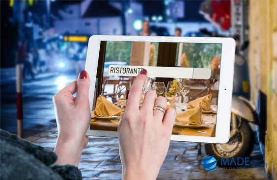
In recent years, the use of the Internet has become increasingly widespread, and more and more people use search engines to look for information on restaurants before deciding where to eat.
In this context, a well-designed Restaurant Website can make the difference between attracting new customers or being ignored.
In this article, our web agency will show you 2 ways to attract new customers online through your Restaurant Website.
If you are a restaurateur and would like to learn more about how you can use your website to attract new customers, read on and find out how Made can help you create a successful Restaurant Website.
1. Capture the essence of your restaurant: 5 tips for taking high-quality food photos
Photography is a powerful tool for presenting your restaurant’s dishes in an attractive and high-quality manner.
Good photography can attract the attention of potential customers and make your regulars’ mouths water.
In this paragraph, our web agency will tell you about expert tricks for taking high-quality, eye-catching food photos.
Lighting is everything
Light is the key to good photography for the Restaurant Site.
Make sure you have a good light source, preferably natural, that illuminates the plate evenly. Avoid bright, direct light, which can create unpleasant shadows and reflections. If you do not have access to a natural light source, use diffuse or soft light to achieve even illumination.
Play with depth of field
Depth of field is the area of the image that appears sharp. Playing with depth of field can be an effective way to emphasise the dish you want to display on your restaurant website.
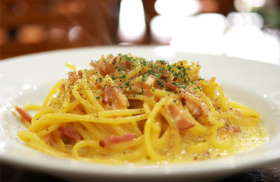
To emphasise the dish, use a shallow depth of field to blur the background.
If, on the other hand, you want to show the ambience of the restaurant, use a greater depth of field to keep everything sharp.
Focus on details
Food is a multi-sensory experience, so don’t just photograph the dish in a general way.
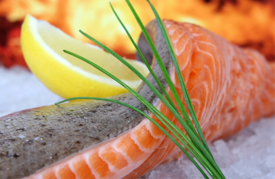
Focus on the details that make it interesting, such as texture, colours and decorations.
Experiment with different angles and perspectives to find the best position to bring out the details of the dish.
Play with colour
Colour is a fundamental element of food photography.
Experiment with colours to create an appealing and inviting image.
Use colour to create contrast between the plate and the background. Also, try to use coloured or decorated plates to create a visually interesting image.
Conversely, if you want to opt for a white plate, our web agency suggests you place it in a visually pleasing context.
Pay attention to presentation
The presentation of the dish is essential for successful food photography.
Try to present the dish in an elegant and inviting way, using decorations such as herbs or sauces to create a more appealing appearance. Remember that food should look fresh and inviting, so try to avoid photographing dishes that look dull or unappetising.
With a little practice and effort, you can

create dishes that highlight your restaurant on the website.
2. Creating an effective menu: 4 tricks for you
When customers search for a restaurant online, the first thing they want to know is what kind of food is served.
In fact, in recent years, the use of online menus has become increasingly popular among restaurants, both because of the pandemic that has made physical access to establishments more difficult, and because of the convenience and efficiency it offers customers.
However, in order to offer an easy and effective navigation experience to your customers, it is important to create an online menu that is well structured and presented on your restaurant website.
In this paragraph, our web agency will reveal some tricks that will help you increase sales on your restaurant website.
The structure of the online menu
The first thing you should do when creating an online menu on the website for your restaurant is to decide on its structure.
The menu should be divided into clear and easily understandable sections, such as starters, main courses, side dishes, desserts and drinks.
In addition, our web agency suggests you create sub-categories within each section, such as ‘fish’ or ‘meat’ under the ‘main courses’ section.
Description of dishes
In addition to the general menu structure, it is important to provide a brief but detailed description of each dish, including the name, main ingredients and any food allergies or restrictions.
If you offer vegetarian, vegan or gluten-free options, be sure to highlight them clearly.

The presentation of dishes
Once the menu structure has been decided, it is time to focus on the presentation of the dishes.
Images of dishes are an effective way to stimulate customers’ appetites, but it is important to use them in moderation and only for the most representative dishes.
In addition, the images should be high quality and professionally shot. But we have already discussed this in the previous section.
As for the text, the names of the dishes should be clear and appealing, but also easily understood.
Avoid using overly technical or exotic terms that might confuse customers. Rather try to highlight the distinctive features of your dishes, such as special ingredients or innovative cooking methods.
The browsing experience
In addition to the menu structure and presentation of dishes, anotherfundamental aspect of creating an online menu, to be included in your restaurant’s website, is the browsing experience.
The menu should be easy to navigate and accessible from any device, including smartphones and tablets.
Also make sure the menu is updated regularly to avoid confusion or disappointment on the part of customers when their chosen dishes are not available.
Also, consider including options for customising dishes, such as choosing the degree of cooking of the meat or adding or removing ingredients.
The last tip our web agency would like to give you is to place the dishes in the online menu in a non-random order and to exploit the Primacy and Recency Effect. Both are the most widely used and exploited cognitive biases in marketing.
Website for Restaurant: conclusions
In conclusion, an attractive and effective website can make all the difference for your restaurant, helping you to attract new customers and retain existing ones.
From attractive design to intuitive functionality, a well-designed website can enhance the customer experience and increase the visibility of your restaurant.
If you are a restaurateur and would like to create a website for your restaurant, contact Made may be the right choice for you.
Our web agency is equipped with a department specialised in the creation of Restaurant Websites and offers customised solutions to meet the needs of your business.
With our experience and collaborative approach, we can help you create a website that best represents your restaurant and achieves your business goals.
Contact us today and find out how Made, our web agency, can help your restaurant succeed online.

